Census, BEA, CDC, BLS: why US state data is unusually good
Ranking a country among US states only works because four federal agencies publish state-level numbers most countries can't match nationally — including price-adjusted GDP.
On this page
The whole premise of Ranking Countries — drop France into the list of US states and see where it lands — only works if state-level numbers exist that are as rigorous as national ones. In most of the world, they don't. Regions get rough survey estimates years late, if anything.
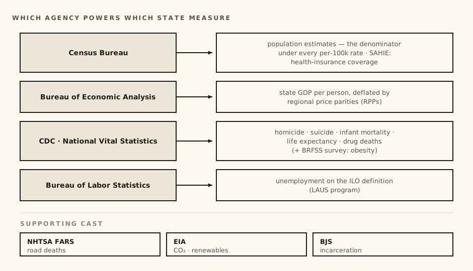
The United States is the great exception. A handful of federal statistical agencies publish state-by-state data of a quality most countries would envy at the national level. Our state side is built almost entirely on four of them.
The four agencies doing the heavy lifting
The Census Bureau produces the population estimates under every "per 100,000" on this site, and small-area programs like SAHIE, which estimates health-insurance coverage down to the county level.
The Bureau of Economic Analysis (BEA) publishes GDP for every state, every year — plus the tool that makes state GDP honest, which gets its own section below.
The CDC runs the national vital statistics system: every death certificate in the country flows into databases like CDC WONDER, coded by cause. That single system gives us state-level homicide, suicide, infant mortality and life expectancy on the same medical basis international agencies use.
The Bureau of Labor Statistics (BLS) estimates unemployment for every state through its Local Area Unemployment Statistics program.
Supporting cast: NHTSA's FARS census of fatal crashes (road deaths), the Energy Information Administration (CO₂ and renewables), and the Bureau of Justice Statistics (state prison populations).
BEA and the price problem inside one country
Here is the subtle one. A dollar is a dollar everywhere in America — but what it buys is not. Rent, groceries and services are far more expensive in New York than in Mississippi, so comparing raw state GDP repeats, inside one country, exactly the mistake that market exchange rates make between countries.
The BEA's fix is regional price parities (RPPs): a measured price level for every state, used to deflate each state's GDP into dollars of equal purchasing power. After that adjustment, our data has New York at about $107,600 per person and Massachusetts at $103,100 (2024), against Mississippi at $61,700 — a real gap in production, not a cost-of-living illusion.
The country side uses the World Bank's PPP adjustment, which solves the same problem with a different program's methods. Both anchor to the US price level, which is what lets us put the UK's $64,600 on the same axis at all — and why GDP per capita carries a grade B on the sources page rather than an A: same idea, two different measuring instruments.
Where the UK lands on that axis
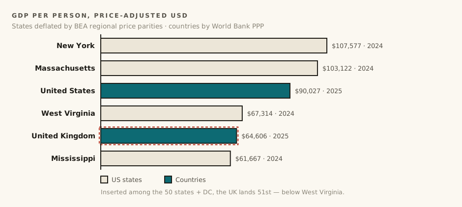
One result worth knowing from that axis: on price-adjusted GDP per person, the United Kingdom currently lands between West Virginia and Mississippi — 51st if you insert it into the list of 50 states plus DC.
CDC: death certificates all the way down
The US registers essentially every death, and codes each one to the WHO's international classification. That completeness is why we can use CDC data for state homicide instead of FBI crime reports (a choice we explain in our post on counting deaths).
It is also fast where it matters. The CDC publishes provisional overdose counts well before final data closes — our drug deaths figures for states already include provisional 2025 data, while many countries' latest figures are years older.
One honest weakness: not everything the CDC publishes is a death certificate. State obesity comes from BRFSS, a telephone survey where people report their own height and weight — and people flatter themselves. The WHO's country figures are measured or modelled instead. That mismatch means state obesity ranks flatter the states, which is why the measure is graded C with that exact warning attached.
BLS: unemployment on the world's definition
State unemployment could easily have been incomparable with country figures — every country has its own benefit rules and legal definitions. It isn't, because both sides of our data follow the ILO's survey definition: you are unemployed if you don't have work, want it, and are actively looking. The BLS state figures and the World Bank's country series ask the same question, which makes unemployment one of our cleanest, grade-A comparisons.
The catch: vintages don't always line up
Excellent data is not always synchronized data. State life expectancy is published on a longer lag than the international series — our current state figures are from 2021, while country figures run to 2024. Road deaths run the other way: state figures are current while the WHO's comparable country set is older.
We don't hide this: every value on the site carries its data year, and the sources page shows when each dataset was last pulled. A rank built on a 2021 state figure and a 2024 country figure is still informative — life expectancy doesn't move that fast — but you should know it when you see it.
The bottom line: America's statistical agencies quietly make this entire site possible. The state side of our data is usually the sturdier side. When a comparison here has a weak link, it is most often the country figure — older, more modelled, or defined slightly differently — and the comparability grade on each row exists to tell you exactly when that is the case.
Sources & further reading
- US Census Bureau — Population Estimates Program — the denominators under every per-100,000 rate on the state side.
- US Census Bureau — Small Area Health Insurance Estimates (SAHIE) — model-based health-insurance coverage estimates down to county level.
- Bureau of Economic Analysis — Regional Price Parities — measured price levels for every state, used to deflate state GDP into dollars of equal purchasing power.
- CDC WONDER — mortality databases — every US death certificate, coded by cause — homicide, suicide, infant mortality and life expectancy on the international basis.
- CDC — Behavioral Risk Factor Surveillance System (BRFSS) — the telephone survey behind state obesity figures — self-reported, hence that measure's C grade.
- Bureau of Labor Statistics — Local Area Unemployment Statistics — state unemployment on the same ILO survey definition the World Bank series uses.
- NHTSA — Fatality Analysis Reporting System (FARS) — the census of fatal crashes behind state road-death figures.
- US Energy Information Administration — State Energy Data System — state-level energy statistics behind CO₂ and renewables.
- Bureau of Justice Statistics — National Prisoner Statistics — state prison populations, collected since 1926.
Every dataset behind the numbers in this post is also listed, with its retrieval date and comparability grade, on the sources page.
Frequently asked questions
Which agencies provide the US state data on Ranking Countries?
Four do the heavy lifting: the Census Bureau (population denominators, health-insurance coverage), the Bureau of Economic Analysis (state GDP and regional price parities), the CDC (every death certificate, coded by cause) and the Bureau of Labor Statistics (state unemployment). NHTSA, the EIA and the Bureau of Justice Statistics fill in road deaths, energy and prisons.
What are the BEA's regional price parities?
A measured price level for every state, used to deflate state GDP into dollars of equal purchasing power. They fix, inside one country, the same problem PPP fixes between countries: rent, groceries and services cost far more in New York than in Mississippi, so raw GDP comparisons mislead.
Where does the UK land among US states on GDP per person?
51st — between West Virginia and Mississippi — if inserted into the list of 50 states plus DC on price-adjusted GDP per person, at about $64,600 against New York's roughly $107,600 in the current data.
Is the state side or the country side of the data more reliable?
Usually the state side. When a comparison on the site has a weak link, it is most often the country figure — older, more modelled, or defined slightly differently. The comparability grade on each row says exactly when that is the case.