How reliable is World Bank data?
A dozen of our measures lean on the World Bank. What its numbers are good for, how often they get revised, and why PPP comparisons deserve a health warning.
On this page
- The World Bank mostly doesn't collect data — it collects collectors
- Numbers change after publication — and that's a feature
- The PPP problem
- Where PPP factors come from
- A tie and a gap, from our own data
- Modelled numbers are estimates, labelled or not
- How to read a World Bank–based rank on this site
- Sources & further reading
- Frequently asked questions
When Ranking Countries says Switzerland produces about $102,500 per person and the United Kingdom about $64,600, both numbers come from the World Bank. A dozen of our measures lean on it — GDP per capita, unemployment, infant mortality, life expectancy, CO₂ emissions, renewable energy and population among them. So it is worth asking the obvious question: how much should you trust it?
The short answer: a lot, for the right things. The longer answer is below.
The World Bank mostly doesn't collect data — it collects collectors
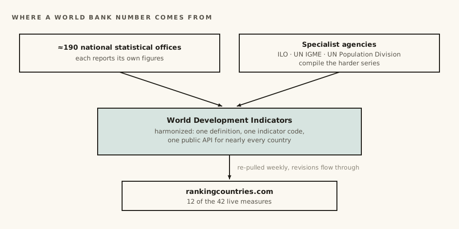
The World Bank does not send survey teams to 200 countries every year. Its World Development Indicators are a clearinghouse: national statistical offices report their own figures, specialist agencies compile the harder ones, and the Bank harmonizes everything onto common definitions and one public API.
You can see this in our own source registry. Our life expectancy series is credited "World Bank / UN Population Division". Infant mortality is "World Bank / UN IGME" — the UN's inter-agency group for child mortality. Unemployment is "World Bank (ILO modelled)", meaning the International Labour Organization does the statistical work. The Bank's real product is consistency: one definition, one indicator code, one place to fetch it for nearly every country on Earth.
That is exactly what a ranking site needs. Comparing 190-plus countries requires someone to have already forced 190-plus statistical offices onto the same definitions. Nobody else does that at this scale, in public, for free.
Numbers change after publication — and that's a feature
World Bank series are revised several times a year. A country restates its GDP, a census corrects a population estimate, a new survey replaces a modelled guess, and the historical series shifts — sometimes years back.
This surprises people, but it is how honest statistics work. First estimates are fast and rough; later estimates are slow and better. The alternative — never revising — would mean freezing early guesses forever.
Our site is built around this. Every measure that has an API is re-pulled automatically every week, so when the World Bank revises a number, ours follows without anyone touching anything. The sources page shows the exact date each dataset was last refreshed. If you screenshot a rank today and it reads slightly differently in six months, that is usually a revision upstream, not an error on either end.
The PPP problem
The trickiest World Bank numbers we use are the PPP ones — "purchasing power parity". The idea: converting GDP at market exchange rates makes cheap countries look poorer than they are, because a dollar buys more haircuts, rent and groceries there. PPP conversion instead asks what money actually buys in each country.
Where PPP factors come from
The catch is the source. PPP factors are built from the International Comparison Program — giant price surveys run only in benchmark years, in between which the factors are extrapolated. Prices are collected for a standard basket that fits some economies better than others. The result is a number that is excellent for big differences and shaky for small ones.
A tie and a gap, from our own data
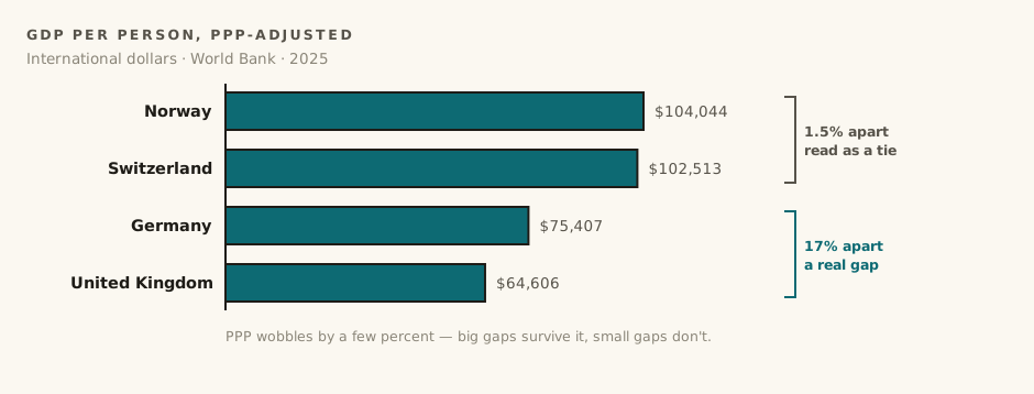
Concretely: Germany at roughly $75,400 per person versus the UK at $64,600 is a real, meaningful gap — PPP uncertainty does not explain a difference that large. But Switzerland at $102,513 versus Norway at $104,044 is best read as a tie. If a measurement method has a few percent of wobble, a 1.5% gap is noise wearing a ranking.
There is a second, homegrown caveat. When we rank countries against US states, the state figures are deflated using a different program: the Bureau of Economic Analysis's regional price parities, which adjust for price differences between states. Both adjustments anchor to the US price level, but they come from different agencies with different methods — which is why GDP per capita carries a comparability grade of B on our sources page, not an A.
Modelled numbers are estimates, labelled or not
Some World Bank series are explicitly modelled. Our unemployment data uses the ILO's modelled estimates: for countries with strong labour-force surveys, the model mostly passes the survey through; for countries without them, it fills the gap with statistical inference. The United States' 4.2% is backed by a monthly survey of tens of thousands of households. Some countries' figures are closer to educated guesses on the same scale.
We use the modelled series anyway, because it is the only one where every country answers the same question — "what share of people who want work and are looking for it can't find it?" — instead of each country's legal definition of who counts as unemployed. Comparable-but-modelled beats precise-but-incompatible for cross-country ranking. It is still worth knowing which one you are looking at.
How to read a World Bank–based rank on this site
- Trust the direction and the size of big gaps. If two countries are 20% apart, that is real.
- Don't read meaning into small gaps or adjacent ranks. 23rd versus 25th is usually within the noise.
- Check the year. Each value on the site carries its data year, and they are not always identical across countries.
- Remember revisions. Weekly refreshes mean our numbers track the Bank's current best estimate, not the first headline.
None of this makes World Bank data unreliable. It makes it what all good data is: an estimate with known limits. The failure mode isn't using it — it's forgetting the limits.
Sources & further reading
- World Bank — World Development Indicators — the compilation we draw from, with per-indicator definitions and source notes.
- World Bank — GDP per capita, PPP (current international $) — the exact indicator behind our country GDP figures.
- World Bank — International Comparison Program (ICP) — the global price-survey program PPP conversion factors are built from, run in benchmark years.
- ILOSTAT — ILO modelled estimates, methodological overview — how the ILO fills gaps with econometric models to make unemployment comparable across countries.
- World Bank — Unemployment, total (modeled ILO estimate) — the modelled unemployment series we use, as published by the Bank.
- UN IGME — Child mortality estimates — the inter-agency group whose estimates sit behind the Bank's infant-mortality series.
- Bureau of Economic Analysis — Regional Price Parities — the separate US program we use to price-adjust state GDP — same idea as PPP, different instrument.
Every dataset behind the numbers in this post is also listed, with its retrieval date and comparability grade, on the sources page.
Frequently asked questions
Does the World Bank collect its own data?
Mostly no. The World Development Indicators are a clearinghouse: national statistical offices report their own figures, specialist agencies like the ILO and UN IGME compile the harder ones, and the World Bank harmonizes everything onto common definitions and one public API. Its real product is consistency, not collection.
How often is World Bank data revised?
Several times a year. Countries restate GDP, censuses correct population estimates, and new surveys replace modelled figures — sometimes shifting the historical series years back. Ranking Countries re-pulls the API weekly, so the site tracks the Bank's current best estimate rather than the first headline.
How accurate are PPP-adjusted GDP comparisons?
Excellent for big differences, shaky for small ones. PPP factors come from the International Comparison Program's benchmark-year price surveys and are extrapolated in between. A gap like Germany's roughly $75,400 versus the UK's $64,600 is real; Switzerland at $102,513 versus Norway at $104,044 — about 1.5% apart — is best read as a tie.
Why does GDP per capita carry a comparability grade of B on this site?
Because the two sides are price-adjusted by different programs: US states use the Bureau of Economic Analysis's regional price parities, while countries use World Bank PPP. Both anchor to the US price level, but they are different instruments from different agencies — same idea, grade B rather than A.